12.30.2021

Hike || Paper Issues

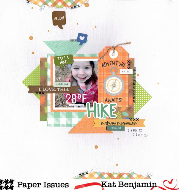
Hi everyone!  Have you had so much fun with finding scrappy inspiration from all the Hallmark movies challenges over at Paper Issues this month?  I have!  Today, I am here to share my last layout of the year - and this one is for the One Royal Holiday prompt.  

While it was suggested that you could use this prompt to scrap snowy photos, I decided to just scrap a really cold photo (well, cold for me by Southern California standards lol).  I wanted to scrap this photo that I took of my daughter when we were visiting Big Bear Lake for Thanksgiving.  I had used the filter on Instagram where you can put the temp and location on the photo.  As I mentioned, we are from a warm climate and almost never experience freezing weather, so I did want to get this photo documented.

Because the picture features my daughter exploring the outdoors, I decided to use the new Doodlebug Great Outdoors collection.  I think the patterns are so cute and I really love how Doodlebug is coming out with the Petite Print packs now.  They are perfect!

Here is what I whipped up:


Thanks so much for stopping by!  And don't forget - each team member has a code that you can use to save 20% off your store order.  my code is KAT20 :)


12.10.2021

Paper Issues Holiday challenge

Good morning, friends!   I want to share my take on Paper Issues' "The Christmas Doctor" challenge (all the challenges this month are based off of holiday movies).  I chose to tackle this challenge from the perspective of traveling out of town for the holidays.  We recently went to Big Bear for Thanksgiving, so this challenge was the perfect excuse to get some of those photos immediately on a page!

I used some papers and stickers from the new Fernwood collection by Vicki Boutin, as well as some labels and stickers from Elle's Studio.  I wanted to create a design where I could incorporate a lot of photos without it feeling too "heavy" so I created a bunch of frames and squares from the papers. 

Here's what I whipped up:


I cannot wait to see how you interpret this challenge!  Make sure to play along with us this month!  And don't forget: every design team member has a code you can use to save 20% off your store purchase.  My code is KAT20.


11.12.2021

A Pizza My Heart || Paper Issues

Good morning everyone!  I just wanted to share my take on the Pizza my Heart challenge over at Paper Issues.  The challenge is simple: make some kind of pie chart on your project.  But, I took it literally and made a heart pie chart :) 

I actually got the idea for my layout when I saw the newest Autumn Tabs stamp set from Elle's Studio.  There is one phrase that says "home sweet home" and I knew I just wanted to highlight that phrase as much as possible.  I stamped the phrase down one side of my layout using 4 different Distress Oxide colors.  Then I built my heart using a bunch of different papers from my Elle's stash.  Finally, I created my title by using the large Jane alpha stamp and fussy cutting the letters out.


Here is the final result:


I can't wait to see how y'all interpret the challenge.  Make sure you pay along with us in our Facebook group.  Also, don't forget that each design team member has a code you can use to save 20% off your entire store purchase.  My code is KAT20 :)


10.31.2021

Happy Halloween || Pretty Little Studio

Good morning and HAPPY HALLOWEEN!  I'm here today and I'm so excited to share with you my newest Pretty Little Studio project.

I'm a person who loves to compare year to year photos.  So, of course, I needed to start an album where I keep all my daughter's Halloween pictures in one place.  For her first year, I decided to use the awesome Goosebumps collection.

I made a two-page spread to highlight all the photos from the year that I wanted to remember.  Here's what I came up with:


Thanks for stopping by today!  I hope you have a fun and safe Halloween! :) 

10.19.2021

Pretty in Pink || Paper Issues

Good morning, friends!  I'm pretty excited about the Paper Issues challenge I'm sharing today.  The challenge is a Pretty in Pink challenge, and you just have to make the color pink the main focus of your page.  That's easy for me.  I am the mama to a girly girl and I love pulling out all the pinks and purples to document her adventures.

To create this layout, I dug through my stash and pulled out a lot of random items that I've probably been hoarding for way too long.  I used a lot of products from Elle's Studio, though.  I first began with my background.  I used the package technique to "smoosh" down my base color of distressed oxide and then I stamped phrases in a slightly darker shade.  Then, I just randomly built my layout using all the odds and ends I found in my stash.


I definitely got the pink covered :)  Here's the whole layout:

Thank you so much for stopping by today.  I hope you'll be able to play along with us.  And don't forget - every design team member has a special code that you can use in the Paper Issues store to save 20% off your entire purchase.  My code is KAT20.


9.07.2021

80s Mood Board || Paper Issues

Good morning everyone!  Poppin in here to share with you my layout that was inspired by the 80s mood board challenge over at Paper Issues.  This month, all their challenges are based on mood board. First, here is the mood board I used for today...I love the colors:


I used the amazing colors as my inspiration for my layout.  I used the Color Study collection by Vicki Boutin, as it has a lot of the beautiful, vibrant colors from the mood board.  I picked out the pinks and purples from the collection and had a fun time creating a sort of symmetrical layout, where I tried to mimic the design on the top in the design on the bottom.

Here's what I whipped up:


I hope you can play along with us this month.  A whole month of mood boards is so fun and inspiring!  Also, don't forget that you can use any design team member's code to save 20% off your full store purchase.  My code is KAT20.  :)


8.13.2021

Carry the Torch Challenge || Paper Issues

Good morning everyone!  Happy Friday!  I wanted to pop in and share my take on this month's "Carry the Torch challenge over at Paper Issues.  This challenge is about scrapping fire - bon fire, s'more fires, or in my case - birthday fire (well, candles)!

I used some photos from my daughter's last birthday to highlight her with her birthday cake.  I pulled out the Elle's Studio birthday collection for this one.  I kept my design fairly simple and just created an easy grid made of 3x4 rectangles.  I also sprinkled around some embellishments in the form of wood veneers and cardstock stickers.  My favorite feature of my layout is the repeated date along the right side of the page.  I stamped my date stamp in a bunch of different Distress Oxides to create that border.  Here's what I came up with:

I hope you're able to play along with us this month!

Also, don't forget that each design team member has a code you can use in the PI store to save 20% off your entire order.  My code is KAT20.  Enjoy your weekend, friends! :)

8.04.2021

Wednesday Sketch || Paper Issues

Good morning everyone! It's Wednesday, which means it's time for a new sketch!  Today's sketch was designed by Lindsey and is so much fun:

I loved the block-style design of the layout and the opportunity to get 3 photos on the page.

I had some cute photos of my daughter playing in a creek and knew that the new products from Elle's Studio would be perfect to use.  While I tried to keep pretty close to the original sketch, I did add some extra scallops and moved the scallops to frame my photos instead of my patterned paper block.  I also moved the positioning of the tags.  Here's what I came up with:

I loved this sketch because it gave me a really good starting point, but also gave enough room for me to work in my own style.  

I hope you can play along with us this month!  And don't forget: each design team member has a code that you can use in the PI store to save 20% off your entire order.  My code is KAT20.  Happy scrapping! :)


7.23.2021

Check Out the Scenery || Paper Issues

Good morning everyone!  I wanted to share my take on this month's Paper Issues Check Out the Scenery challenge.  This challenge is a mood board challenge, which is always fun to do!  Here's the board:


 Isn't it gorgeous?  I love the colors and the chill vibe.  Those two factors led me to work with the Heidi Swapp Carefree collection.  That collection gives off the same vibes as this mood board.

My favorite products from that collection are the definition stickers, so when I saw the definition in the mood board, I knew I had to incorporate one of those stickers.  I also really liked the graphic look of all the squares of calming colors, so I decided to do that for my layout, too. I cut out squares and letter using my Silhouette. I backed some of the squares with patterned papers and some of the squares with photos, then I added the letters from my title on top of them all.  Finally, I finished everything off by adding some minimal embellishments.  Here's what I created:

This one is pretty different from my normal style, but I like that the mood board brought me here. :)

I hope you can play along with us this month!  Also, don't forget that every design team member has a code you can use to save 20% off your entire store order.  My code is KAT20. :)


7.13.2021

Wide Open Spaces || Paper Issues

Hi, everyone!  I just wanted to stop in today to share my take on this month's Wide Open Spaces challenge over at Paper Issues.  This challenge is all about using white space.  This was a super easy challenge for me because almost all of my layouts have white space.  The layout I'm sharing today has a little less white space than I'm used to, so I was originally worried that I had overdone it a bit.  LOL.

For this layout, I wanted to scrap some photos of my daughter and the plants she grew from seeds.  She was so proud of them and looked so excited.  I thought the perfect collection for documenting these photos was the Cute & Crafty collection from Doodlebug.  I especially love the flower die cuts. :)


To make this layout, I created a large rip in the bottom of my cardstock base and a smaller rip at the top.  I backed it with the pretty bold striped paper from the Doodlebug collection.  Then, I just layered a bunch of the die cute around the photos.  Finally, I sprinkled around some Bella Blvd trinket stickers to finish off my look.

Here's what I came up with:


I really hope you decide to play along with us!  And don't forget - each design team member has a code you can use in the store to save 20% off your entire purchase.  My code is KAT20, if you're so inclined :)


6.09.2021

Sketchy Wednesday || Paper Issues

Good morning everyone!  It's Wednesday, which means there is a new Paper Issues sketch to share with you today!  I always love a good sketch, as they always seem to jumpstart my creativity.

Here's the sketch we're working with today:


I decided to use the fun Brave + Bold collection by Amy Tangerine to highlight a cute photo of my girl.  I picked out the color palette I wanted to used and then went to work.  

I began by using some distressed oxide (peacock feathers) to create the blob on the paper.  ("Blob" is the technical term lol.)  Instead of doing strips of paper in corner, I decided to use a large triangle block backed by a slightly distressed neutral pattern.  I also added in little rips along three side of my layout.  Here's what I came up with:


I really hope you are inspired to play along with us!  And don't forget: each team member has a code that will save you 20% off your store purchase.  My code is: KAT20.


6.08.2021

Team || Pretty Little Studio

Good morning everyone! I just wanted to share my newest Pretty Little Studio layout with you today. 

Do you have those collections that you just adore and that you always come back to, no matter how old they are?  I do.  And the Beautiful Day collection is one of mine.  Its one of those collections that just makes me happy and I usually love everything I create with it.

For my layout today, I went with a pretty simple design.  I threw down some Distressed Oxide (Peacock Feathers) first, although I covered most of it up, so it's hard to see (lol).  Then I did some rips along the top and bottom of the page and put my photo backed with pretty die cut flowers down.  This layout only took me about 20 minutes to make, which I attribute to the collection being so inspiring and easy to work with. 

Here's the layout:


Thank you so much for stopping by!

5.27.2021

Stay Golden || Paper Issues

Good morning everyone!  I just wanted to share my layout for the Stay Golden challenge over at Paper Issues.  This challenge asks you to use gold on your layout.

My daughter and I were recently out and about and took a selfie by a fountain where she was playing.  I decided to play up the yellow, black and white clothing that we were wearing.  I dug into my paper stash and pulled out a bunch of papers that matched that color scheme.  Then I created a fun starburst with them.  I love that the starburst design is s popular right now.  It's always such a fun look. 

After I had my starburst created, I added in a few thing strips of gold glitter cardstock to really make the starburst pop.  Then I added in some acetate stitches from Pretty Little Studio, some random yellow embellishments from Elle's Studio and some Bell Pepper Trinkets from Bella Blvd (I LOVE the trinkets!!).

Here's my final project:

I hope you're inspired to play along with us.  And don't forget - each design team member has a code you can use to save 20% off your entire store purchase.  My code is KAT20 :)


5.09.2021

Scraplift Sunday || Paper Issues

Good morning everyone!  It's Sunday, which means there's a new Scraplift happening over at Paper Issues today...and we are lifting a really fun layout from Samara!  Check it out:


I love the original inspiration so much that the only thing I really did to change it up was rotate it.  I used some of the fun new Color Story collection from Vicki Boutin, which I thought was perfect for highlighting these silly photos of my girl.  Here's what I created:


I mean, looking at these photos, I am in trouble, right?!  LOL.

I really hope you're able to play along with us this month...and don't forget - every design team member has a code that you can use to save 20% in the store.  My code is KAT20.


4.28.2021

Paper Issues Sketch

Good morning, everyone!  I wanted to stop by to share my take on the newest Paper Issues sketch.  This one is a fun one...it's a little different than what I'm used to, but it's always fun to go outside my comfort zone.  Here's what we're working with today:

For my take, I decided to flip the sketch and use the new Sunkissed collection by Cocoa Vanilla Studio.  As soon as I saw this giant rainbow paper (called "Bright Side"), I knew I wanted to fussy cut it.  When I saw this sketch, it all clicked for me:


I started by fussy cutting the rainbow and placing it off-center to the right of the page.  Since it was such a large statement, I kept the rest of my layout pretty simple.  I added some acetate stitches from Pretty Little Studio and some minimal embellishments from the rest of the CVS collection.

I hope you decide to play along with us...and don't forget: each design team member has a discount code that you will save you 20% in the store.  My code is KAT20 :)


4.12.2021

Color Spectrum challenge || Paper Issues

Good morning everyone!  Just stopping in today to share a layout that I created for this month's Color Spectrum challenge over at Paper Issues.  It is a mood board challenge, which is always so much fun.  Here's the board we're working with this month:

I've actually been a little low on mojo recently, so I interpreted this mood board pretty literally and decided to create a grid of color blocks.  I used one of the fun 4x6 paper pads from Pretty Little Studio to create this layout (which is exactly an almost identical lift of a layout I made a few years ago...I wasn't joking when I said my mojo is so low).


After my grid was in place, I added some coordinating phrases and enamel dots.  I also used some pop dots to add a little bit of interest to the page.  Here's how it all came together:


I hope you're inspired to play along with us this month!  And don't forget: each design team member has a code you can use in the store to save you 20% off your order.  My code is KAT20, if you're so inclined :)


3.14.2021

Scraplift Sunday || Paper Issues

Good morning, everyone!  It's Scraplift Sunday at Paper Issues!  I love Scraplift Sunday prompts, because if you're in a creative funk, they're always the perfect jumping off point to get back into crafting.

Today we are lifting this fun layout by Sarah Kee:


I always adore Sarah's style.  I frequently scraplift her creations because her style is fun, creative, yet simple enough for me to be able to emulate and put my own spin on.

I loved the smattering of elements on her page and I kept to her design pretty closely, just swapping our hearts and rainbows for circles.  I used a ton of Elle's Studio on this one:


I love how quickly this one came together!  I hope you can play along with us...and don't forget: each team member has a discount code you can use to save 20% off your store purchase.  My code, if you're so inclined, is KAT20 :)


3.08.2021

Pitch Perfect Challenge || Paper Issues

Good morning, everyone!  Have you started on your March challenge entries at Paper Issues yet?  They are all so much fun...and I'm excited to share my take on the Pitch Perfect challenge today.

For the Pitch Perfect challenge, you should create a layout inspired by this album cover:

This album cover is incredibly inspiring, isn't it?  I was especially inspired by the vertical stripes of color, so I used my acrylic paints to create 4 vertical stripes to ground my design.  I then used a bunch of different font white alphas.  Originally, I had planned on painting the alphas to be the same color as the stripes to create a subtle effect, but once I saw them down, I decided to leave them alone.


I then sprinkled around a lot of die cuts and fussy cut flowers and hearts from Kaisercraft's Blessed collection to finish off the look.

Here's my final layout:


I hope you are inspired to play along with us this month.  And, don't forget that each design team member has a code you can use in the store to save 20% off your purchase.  My code is KAT20 :)